Making information
easy to digest
About Aera
Aera by OneFootball is a digital collectibles (NFT) platform featuring the biggest clubs, leagues, federations and players in the football industry.Project Challenge
The Problem
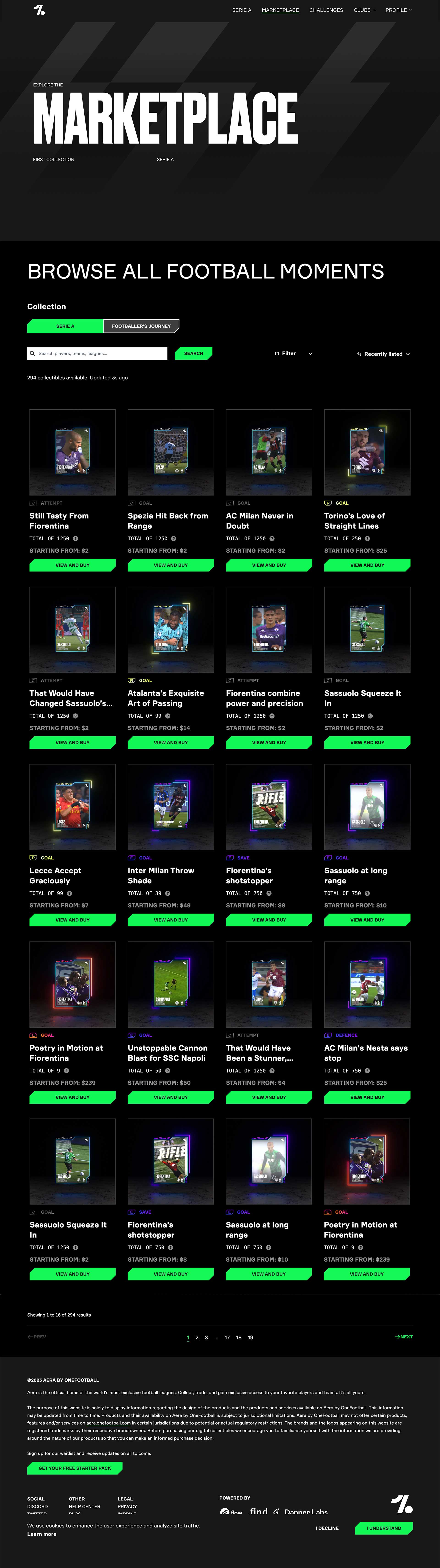
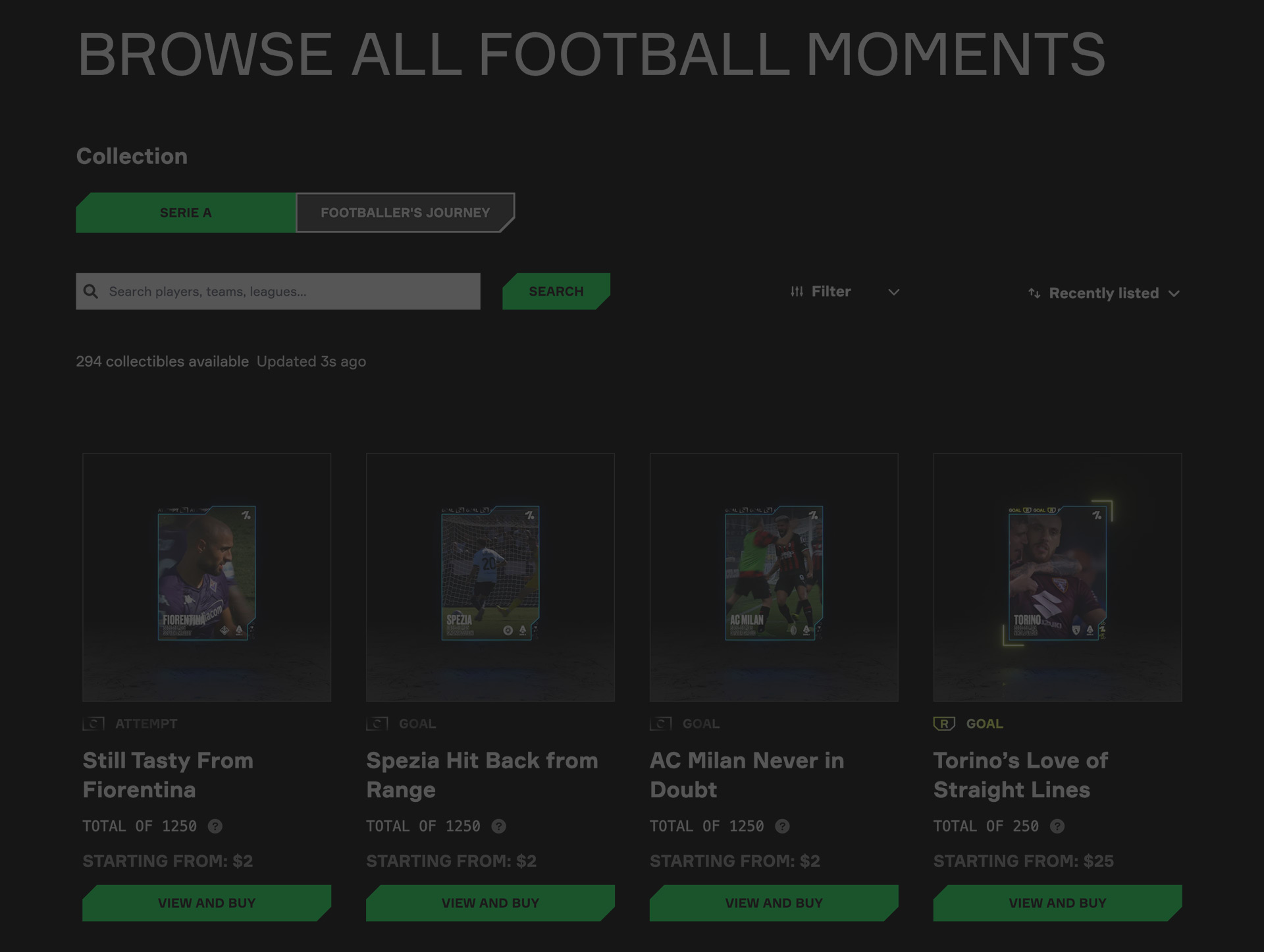
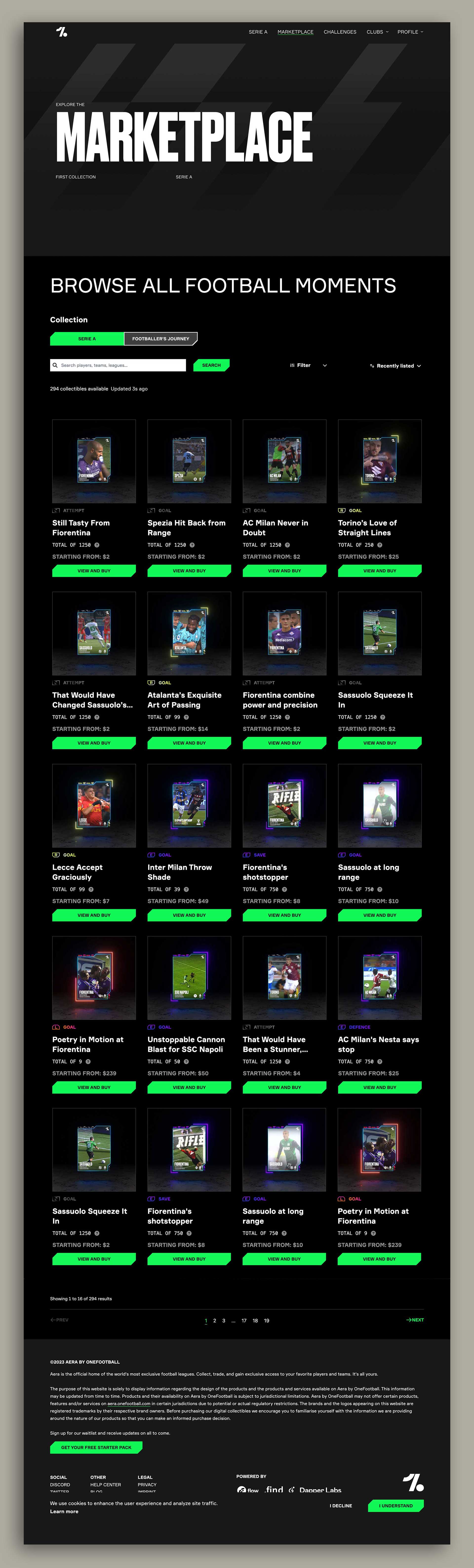
The current Marketplace on Aera has a low user engagement percentage and considering that the Marketplace is the main page that allows users to view and buy digital moments, I was given the task of optimising the marketplace to increase user engagement and improve the usability of the page.
The Approach
I set out the task of optimising the page as follows:
- Conducting research
- Design solutions
- Validating designs
- A/B testing certain functionality
- Setting OKR's
- Setting up data tracking to measure success
01
Research
Objective
I started by conducting extensive research on the target audience, their needs, and the NFT market. This research involved interviewing potential and existing users as well as analysing competitor websites to identify the features and functionality that are most important to users.
Competitor Analysis
After analysing competitor websites the following key takeways were taken into consideration for my design solution:
- Search, filter and sorting should be sticky to allow users to easily find relevant NFT's
- Visually represent different rarity types on NFT's so that users can identify the value of NFT's through cognitive learning
- Optimise the flow in order to reduce the need to navigate back and forth from the marketplace to view more details about each NFT
User Interviews
I conducted user interviews with five potential users and five existing users to ensure that both new and recurring users needs are met in order to increase engagement and usability for both groups. The users were given the task of navigating through the marketplace, filtering for a specfic rarity category, sorting the order of the NFT's, finding two specific NFT's, and finally viewing the NFT details of the two NFT's. The following key takeways were taken into consideration for my design solution:
- 80% of new users tried to click on the images and text instead of the CTA in order to view the NFT details
- 60% of new users navigated using the pagination before realising they could search for NFT's
- 60% of new users struggled to find the rarity categories
- 100% of new and existing users did not know about promotional NFT's
- 80% of new and existing users found that navigating between the marketplace and NFT details page redundant
- 80% of existing users wanted to see new and featured NFT's first instead of filtering and sorting through all the NFT's
- 80% of existing users found the pagination redundant as they would forget which page they wanted to view an NFT they wanted to buy later
- 60% of existing users and 40% of new users wanted a "future purchase/wishlist" feature on the NFT's
I don't feel like buying any NFT's because it's not enticing and it's so difficult to use this marketplace, I would have left this website by now.
02
Designs
Solution
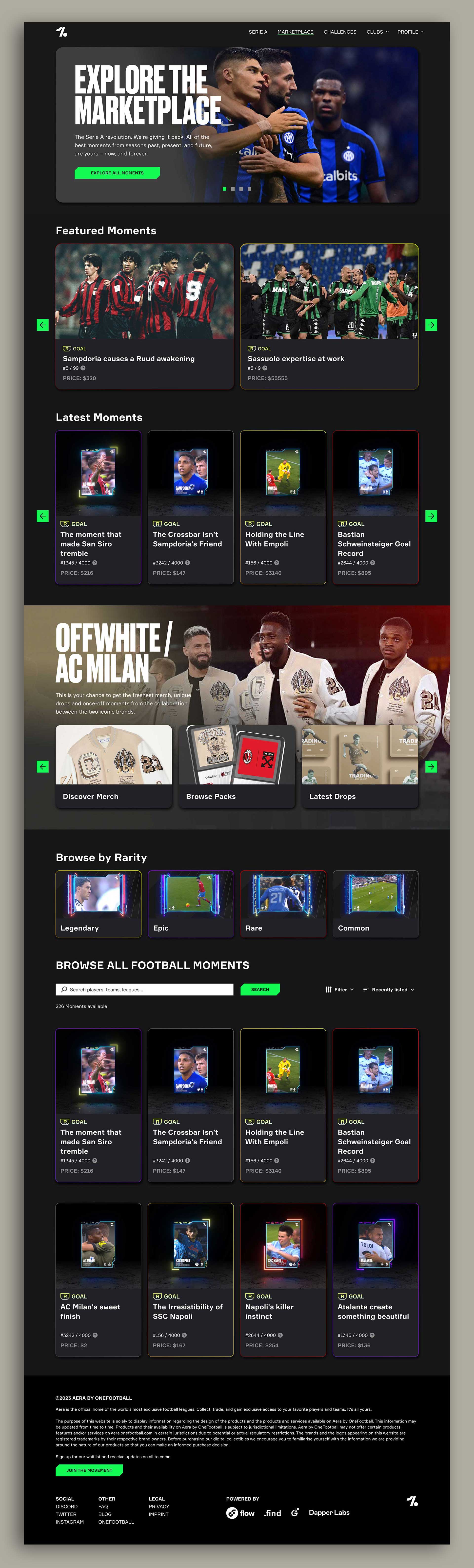
Based on the competitor analysis and user interviews, I designed the marketplace website that includes the following features:
- Contained all elements within clickable cards so that users can easily click and navigate the marketplace
- Differentiated features into a card heirarchy to make the information easier to digest
- Introduced a carousel header that allows Aera to announce new promotional NFT's with the ability to auto-filter for any promotional NFT's using a CTA and auto-scroll
- Created a featured NFT section and new NFT section to make it easier for existing users to browse through the latest offerings
- Added horizontal scrolling for featured and new NFT's so that the page does not become congested with information
- Created a promotional item section as an optional feature to allow more visibility of the promotion
- Created category cards that auto-filters by rarity so that users can easily navigate specfic NFT's they are looking for
- Made the search, filter and sorting sticky with the header once users start browsing all NFT's
- Introduced a rarity stroke around the individual NFT's to help users cognitive load when browsing all NFT's
- Introduced a video preview on hover of the individual NFT cards so that users do not have to click away from the marketplace to view the digital moment
- Introduced a "add to wishlist" icon on each individual NFT card to allow users to save NFT's on their profile that they would like to purchase in future
- Replaced pagination with infinite scrolling so that users do not get lost navigating through different pages of NFT's
03
Validation
Based on the research, I created wireframes and prototype flows to test with the same group of potential and existing users and gather feedback on the design. Using this feedback, I refined the design and created a clickable prototype for user testing. The prototype was tested to identify any usability issues and to determine whether the design met the user's needs.
Key Takeaways
While the user testing recieved positive results, two key issues needed to be resolved from a usability perspective:
- 40% of existing users and 20% of new users preferred the pagination instead of the infinite scrolling
- 60% of existing users and 20% of new users requested a "quick view" feature of the NFT details instead of clicking on the CTA to view the NFT details page.
Next Steps
After liaising with the product manager and engineering lead, the "quick view" feature was deemed out of scope and no designs were created for this improvement feature.
We also decided to A/B test the pagination against infinite scrolling to ensure that any changes made are based on objective data and not just assumptions or personal preferences, ultimately leading to a more user-centered and effective marketplace design. The product manager took the lead on determining the sample size and statisical significance. We agreed to measure data on user engagement, bounce rates and conversion rates to determine which version of the marketplace performed better and ultimately implement the winning version. No design iterations were required for the A/B testing.
04
Metrics
OKR's
The following OKR's were set for the project together with the product manager and lead engineer:
- Increase user engagement by 30% within six months
- Increase the number of transactions by 15% within six months
Data Tracking
To measure the success of the website, the following data will be tracked:
- User engagement metrics, including time spent on the website and number of pages viewed per session
- Number of transactions
05
Conclusion
By conducting extensive research, validating the design through user testing, and implementing a range of features to meet user needs, I was able to design a marketplace website for NFT's that is user-friendly and optimised for success. By setting clear OKR's and KPI's and tracking relevant data, we can measure the success of the website and make adjustments as needed to continue to meet the evolving needs of our users.
However, due to mass layoffs at OneFootball, the designs were never implemented. As next steps, I would have tracked the data to understand if we needed to iterate the designs to improve on the success of this feature and ensure we meet our OKR target.